

5 visualization types I never use as a Data Analyst!
Let me explain why in this thread 🔽
🧵
Let me explain why in this thread 🔽
🧵

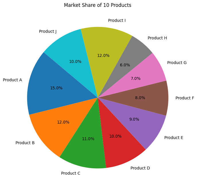
1. Pie charts
Pie charts are horrible for complex datasets, but I would generally avoid them.
They can be difficult to read, and distinguishing between slices of similar sizes is challenging.
Use bar or stacked bar charts instead.
Pie charts are horrible for complex datasets, but I would generally avoid them.
They can be difficult to read, and distinguishing between slices of similar sizes is challenging.
Use bar or stacked bar charts instead.
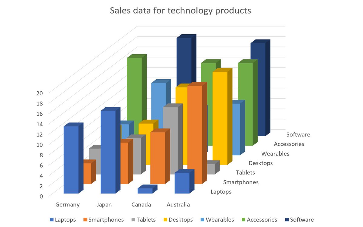
2. 3D charts
3D charts are cool in elementary school projects, but please grow up!
3D graphs can mislead the audience due to their angled perspectives.
If you see a 3D chart someone wants to lie to you!
3D charts are cool in elementary school projects, but please grow up!
3D graphs can mislead the audience due to their angled perspectives.
If you see a 3D chart someone wants to lie to you!
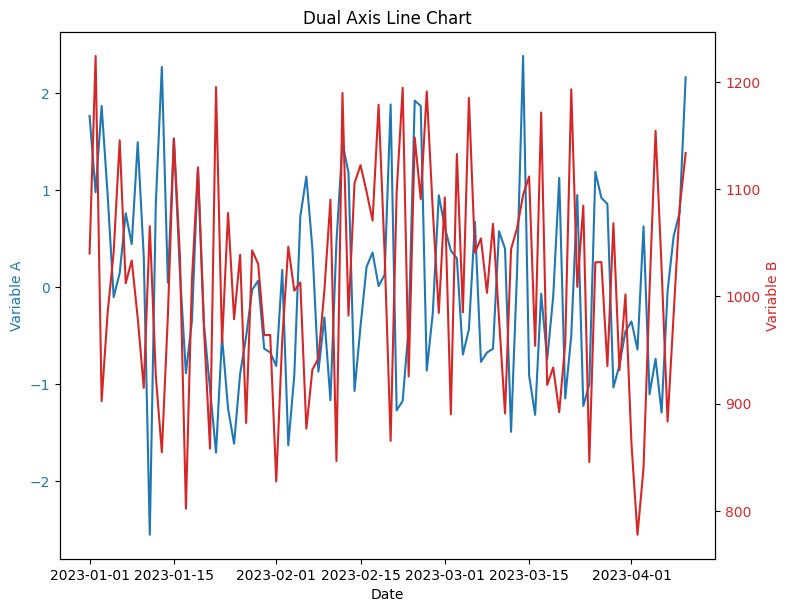
3. Dual-axis line charts for unrelated variables
This is an awesome chart type but often misused.
Don't use this chart if there is no correlation between the two variables you are plotting.
This is an awesome chart type but often misused.
Don't use this chart if there is no correlation between the two variables you are plotting.
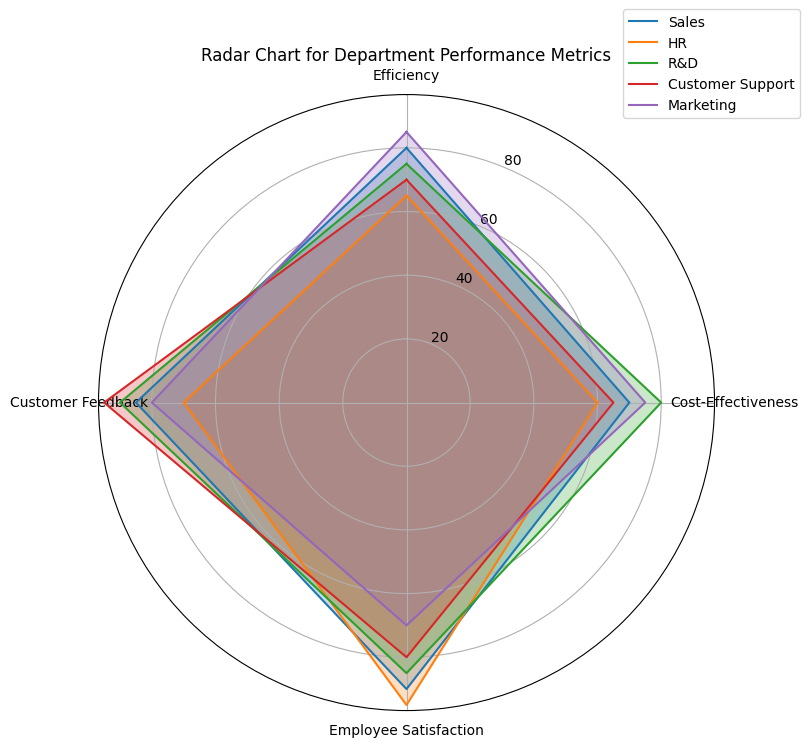
4. Radar charts
These can be useful for displaying multivariate data, but they can be misleading when the variables are not closely related.
Consider the chart below:
HR and Sales are working with different metrics and goals. You cannot compare them.
These can be useful for displaying multivariate data, but they can be misleading when the variables are not closely related.
Consider the chart below:
HR and Sales are working with different metrics and goals. You cannot compare them.
5. Over-Complicated Dashboards / Infographics
Infographics are great for storytelling, but they can sometimes become too complex.
Story and readability > fancy, colorful mess
When an infographic is overcrowded, it can distract from the key message.
Infographics are great for storytelling, but they can sometimes become too complex.
Story and readability > fancy, colorful mess
When an infographic is overcrowded, it can distract from the key message.
That's it for today.
I hope you've found this thread helpful.
Like/Retweet the first tweet below for support and follow @levikul09 for more Data Science threads.
Thanks 😉
I hope you've found this thread helpful.
Like/Retweet the first tweet below for support and follow @levikul09 for more Data Science threads.
Thanks 😉
If you haven't already, join our newsletter DSBoost.
We share:
• Interviews
• Podcast notes
• Learning resources
• Interesting collections of content
dsboost.dev
We share:
• Interviews
• Podcast notes
• Learning resources
• Interesting collections of content
dsboost.dev

Loading suggestions...