

#DataAnalyst Project on T20 World Cup 2022 using #Python📊🥳🏏
It involves collecting & processing #data related to tournament, performing various analyses, & creating visualizations to gain insights
🧵
It involves collecting & processing #data related to tournament, performing various analyses, & creating visualizations to gain insights
🧵
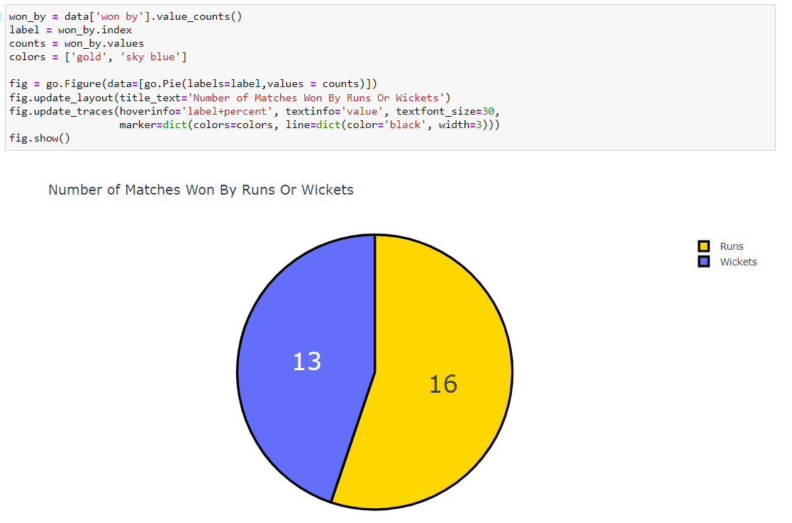
#code create #barchart using #Plotly Express, where each bar represents different team, & height of each bar corresponds to no. of matches won by that team in #T20 World Cup
chart is given title, & it displayed in your interactive envn when you run figure.show().
chart is given title, & it displayed in your interactive envn when you run figure.show().


The x-axis displays the top scorers' names, the y-axis displays their highest scores, and the color of each bar is based on the highest score.
The chart is given a title, and it is displayed in your interactive environment when you run figure.show().
The chart is given a title, and it is displayed in your interactive environment when you run figure.show().

If this thread was helpful to you
1. Follow me @Sachintukumar
for daily content like this
2. Connect with me on Linkedin : linkedin.com
3. RT the tweet below to share it with your friend
1. Follow me @Sachintukumar
for daily content like this
2. Connect with me on Linkedin : linkedin.com
3. RT the tweet below to share it with your friend

Loading suggestions...