

Monthly Price-Quantity Map for US Tobacco Consumption (1929 - 2023).
Blue dots moving to the right means the total quantity consumed is increasing (growth). Blue dots moving up means the price per unit is increasing (inflation).
(additional context below)
Blue dots moving to the right means the total quantity consumed is increasing (growth). Blue dots moving up means the price per unit is increasing (inflation).
(additional context below)
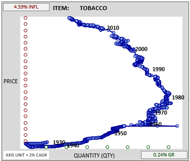
The red and green circles are the axis references. Each circle corresponds to the equivalent of 2% compound annual growth over a 10 year period. The y-axis is price, the x-axis is quantity consumed.
It's clear from the chart that tobacco consumption peaked in the early 1980s. But the strong inflation in tobacco prices has kept tobacco companies very profitable, amid the consumption decline.
Loading suggestions...