

Bitcoin is going to see two very rare TA events happen very soon that might affect your trading plans.. 🤔
See what these are and what do they indicate here in our thread →
🧵(1/6)
See what these are and what do they indicate here in our thread →
🧵(1/6)

The golden cross is a TA pattern that occurs when the short-term average price (50) moves above a longer-term average price (200). If the short-term price is higher than the longer-term price, it generally indicates that sentiment around an asset's price is optimistic.
(2/6)
(2/6)
By contrast, the death cross is a chart pattern that signals a growing weakness in an asset’s price, as the short-term average price (50) moves below the longer-term average price (200).
(3/6)
(3/6)
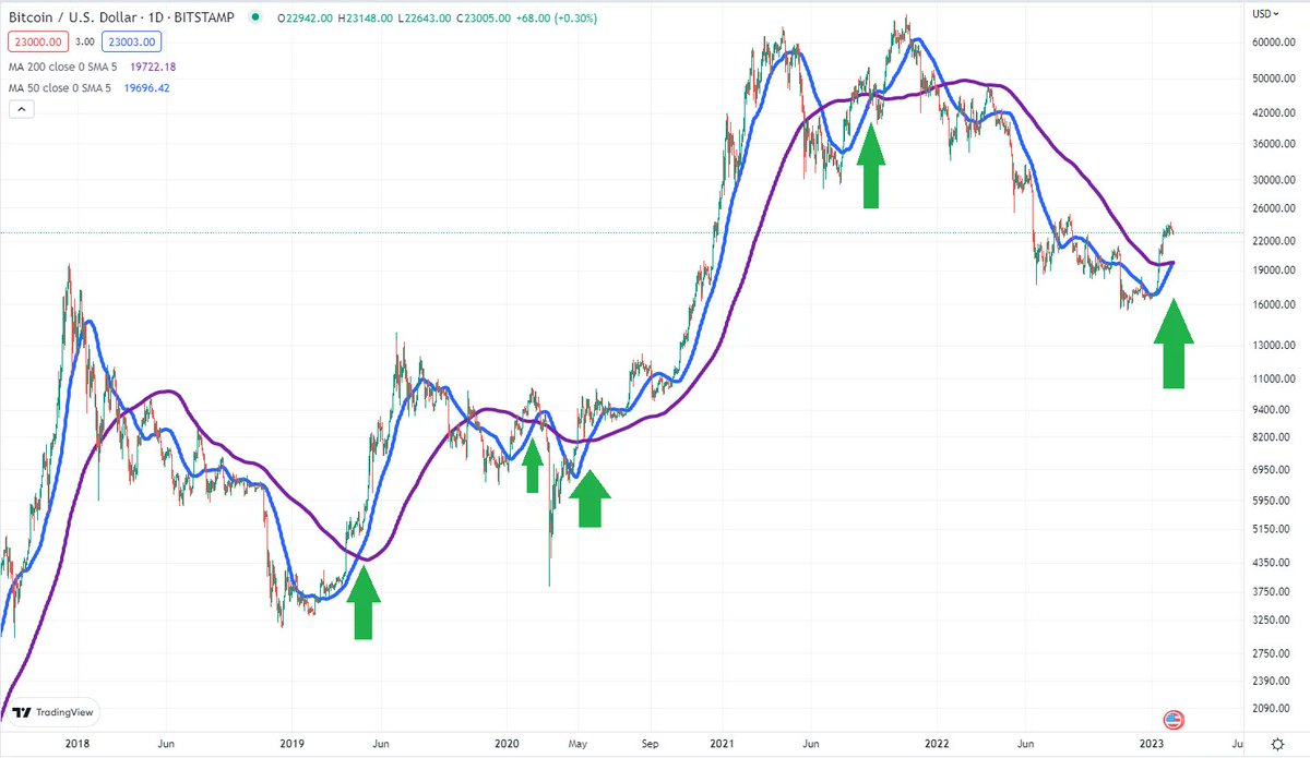
Bitcoin is currently seeing a golden cross on the daily timeframe. The chart below shows the 200 day moving average in purple and the 50 day moving average in blue. Green arrows are the crosses.
This is the first golden cross on the daily timeframe since September 2021.
(4/6)
This is the first golden cross on the daily timeframe since September 2021.
(4/6)
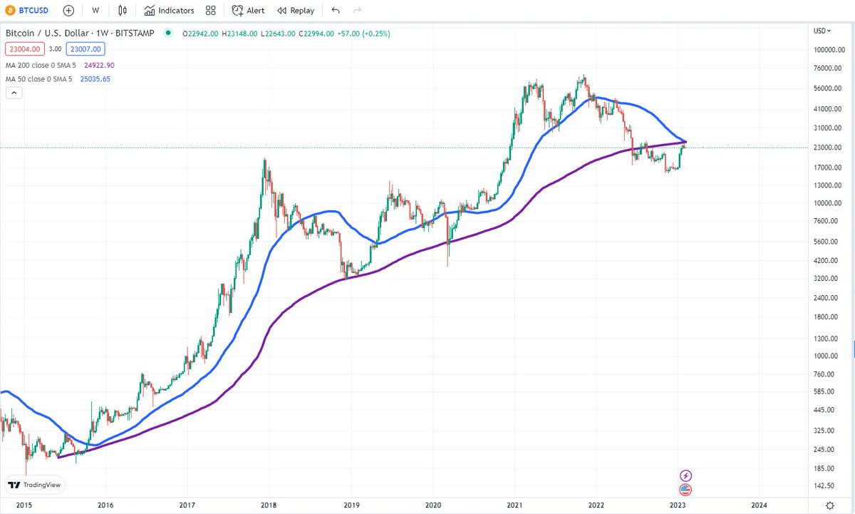
Yet on the weekly timeframe, Bitcoin is about to have the first death cross in Bitcoin's history, as the 50 week MA will move below the 200 week MA, either this week or next. We escaped this moment from happening in 2015 with a huge pump.
(5/6)
(5/6)
Which pattern would you follow? The golden cross on the daily levels or the death cross on the weekly ones?
We would like to be optimistic and say the death cross is a result of the deadly 2022 we’ve had and would much likely go for the golden cross here.
We would like to be optimistic and say the death cross is a result of the deadly 2022 we’ve had and would much likely go for the golden cross here.
Loading suggestions...