

Master Flexbox: A Comprehensive Guide🚀
A Thread ↓
A Thread ↓
To fully understand Flexbox, make sure to read Part 1 if you haven't already.
Recap: In Part 1, we covered the introduction to Flexbox, including its main entities, the `flex-container`, and `flex-item`, as well as the display property. We also discussed the flex-direction property.
Next, we will learn about advanced Flexbox topics such as flex-wrap, align-items, justify-content, and responsive design.
⚡ Flex Wrap
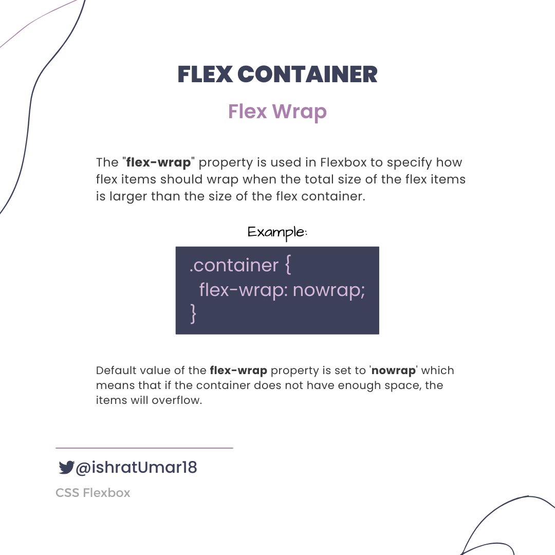
⚡ flex-wrap

There is another shorthand property, `flex-flow`, which allows setting both the `flex-direction` and `flex-wrap` properties in one line.
Example:
Example:

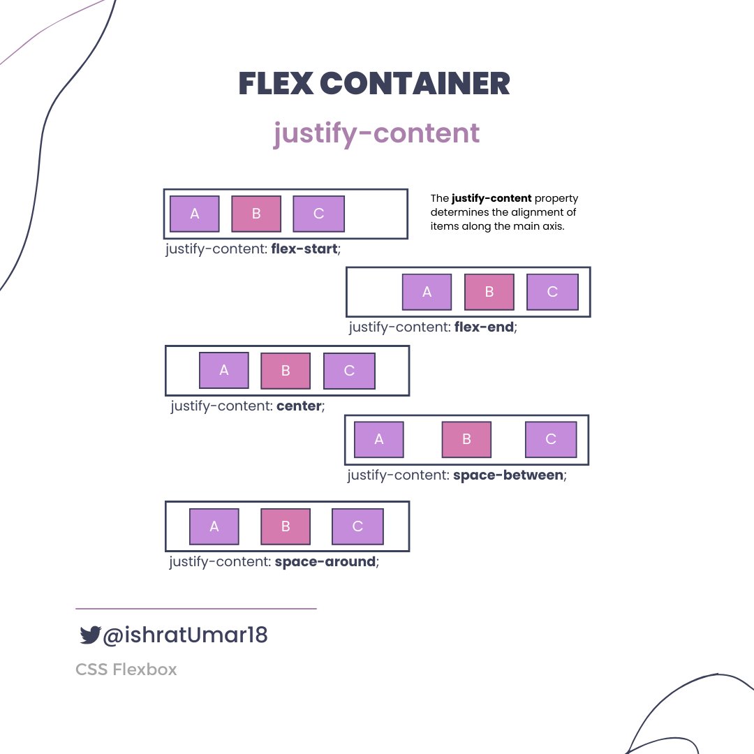
⚡ justify-content
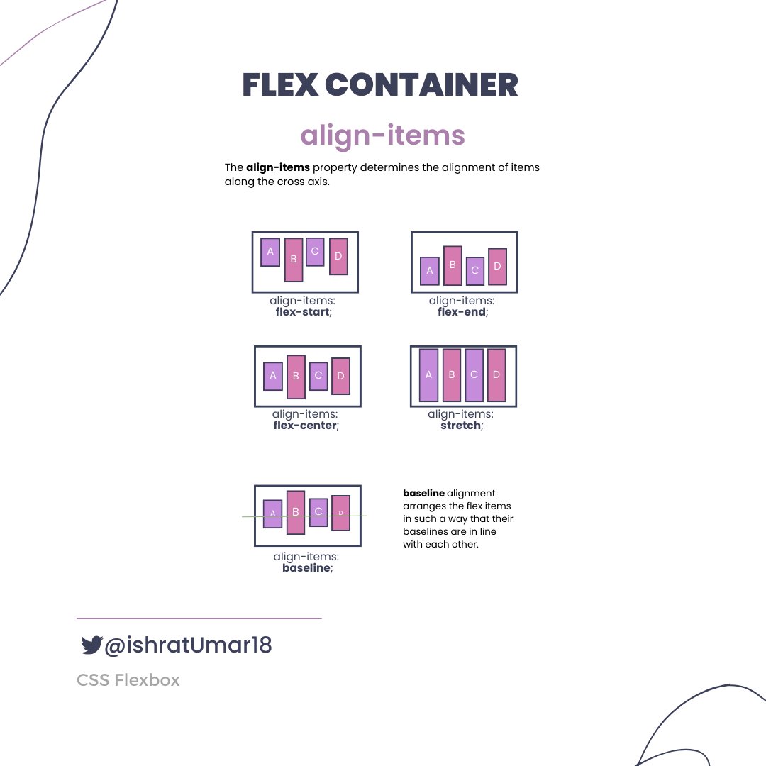
⚡ align-items
⚡ align-content

Flex items
⚡ order property
⚡ order property

⚡ Flex Items Properties

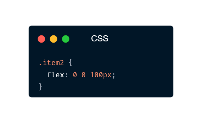
The `flex` property is a shorthand for the `flex-grow`, `flex-shrink`, and `flex-basis` properties.
Example:
The element with the class "item2" will have a starting width of 100 pixels, and it will not grow or shrink in size relative to the other flex items in its container.
Example:
The element with the class "item2" will have a starting width of 100 pixels, and it will not grow or shrink in size relative to the other flex items in its container.
⚡ align-self
The `align-self` property is similar to the `align-items` property that is used for Flex Containers, but it is applied to individual Flex Elements. It overrides the default alignment set by the `align-items` property.
It can take the following values:
The `align-self` property is similar to the `align-items` property that is used for Flex Containers, but it is applied to individual Flex Elements. It overrides the default alignment set by the `align-items` property.
It can take the following values:

That's a wrap. Thank you so much for reading!
If you found it helpful, like and retweet the first tweet and follow @ishratUmar18 for more awesome content.
If you found it helpful, like and retweet the first tweet and follow @ishratUmar18 for more awesome content.
Loading suggestions...