
🎁 Get 30% off my UI design book today only on design.gifts ✨
Stoked to be featured on the 24 days of design gifts countdown by @FonsMans & @framer 🙏
Here's 1 of 100+ design guidelines from my book 📘
A quick thread👇
#uxui #uxdesign #uidesign #productdesign #ux
Stoked to be featured on the 24 days of design gifts countdown by @FonsMans & @framer 🙏
Here's 1 of 100+ design guidelines from my book 📘
A quick thread👇
#uxui #uxdesign #uidesign #productdesign #ux
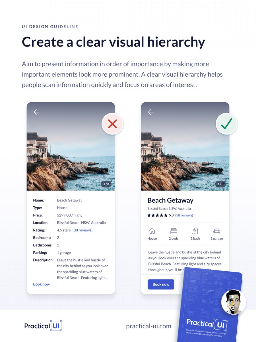
Create a clear visual hierarchy using variations in:
1️⃣ Size - make important elements larger.
2️⃣ Colour - use brighter, richer, warmer, or higher contrast colours for more important elements.
3️⃣ Contrast - style important elements differently to help them stand out.
1️⃣ Size - make important elements larger.
2️⃣ Colour - use brighter, richer, warmer, or higher contrast colours for more important elements.
3️⃣ Contrast - style important elements differently to help them stand out.
4️⃣ Spacing - surround important elements with more space.
4️⃣ Position - place important elements toward the top of an interface or first in a row of multiple items.
6️⃣ Depth - elevate important elements so they appear closer to users.
Here are some examples from the book 👇
4️⃣ Position - place important elements toward the top of an interface or first in a row of multiple items.
6️⃣ Depth - elevate important elements so they appear closer to users.
Here are some examples from the book 👇
Example 1
The following hero banner example lacks a clear visual hierarchy.
Because all interface elements have similar prominence, our eyes don’t know what to focus on first.
This lack of order can cause confusion and increase cognitive load, plus it looks messy.
The following hero banner example lacks a clear visual hierarchy.
Because all interface elements have similar prominence, our eyes don’t know what to focus on first.
This lack of order can cause confusion and increase cognitive load, plus it looks messy.
We use size, colour, and contrast to create a clear visual hierarchy.
This makes it quicker and easier for people to find the information they need and take the appropriate action.
This makes it quicker and easier for people to find the information they need and take the appropriate action.

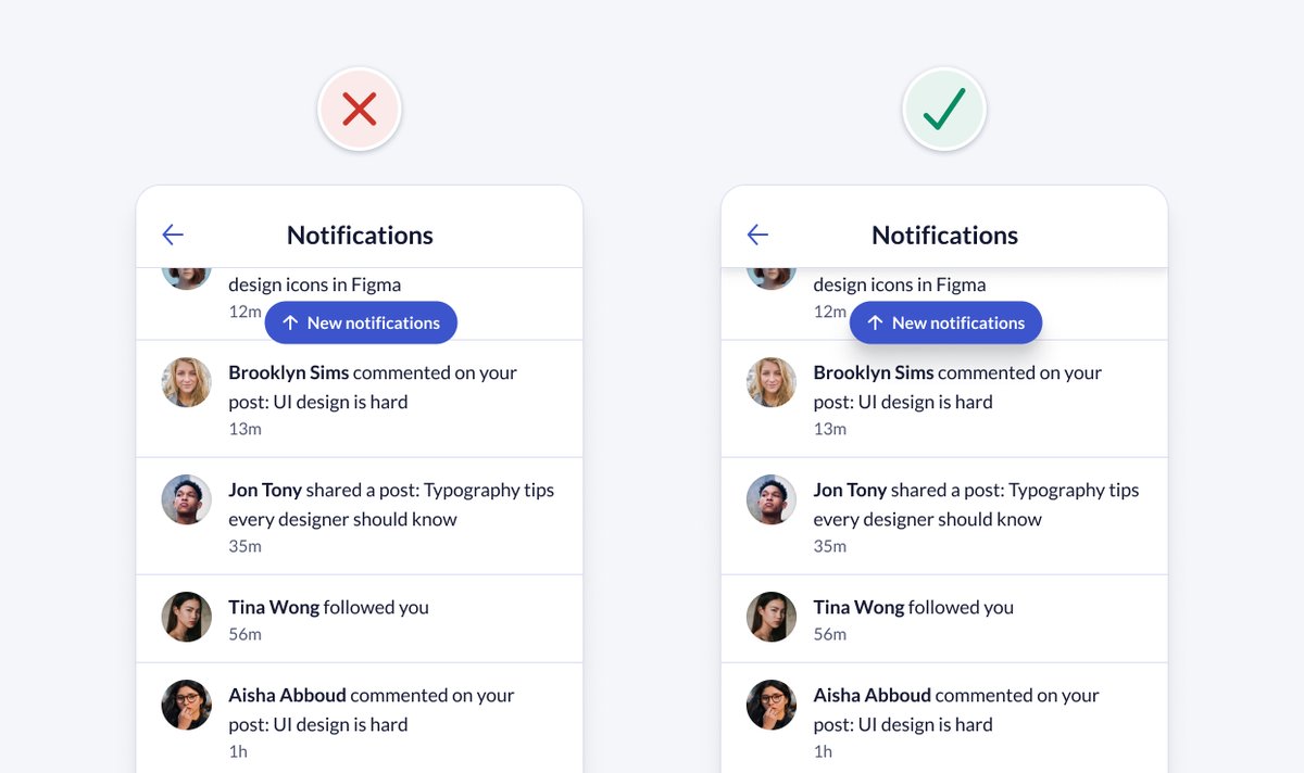
Example 2
Depth, or different levels of elevation, can also be used to help create a clear order of importance or visual hierarchy.
More important things should be elevated higher to make them more prominent.
Elevation can also make interface elements feel interactive.
Depth, or different levels of elevation, can also be used to help create a clear order of importance or visual hierarchy.
More important things should be elevated higher to make them more prominent.
Elevation can also make interface elements feel interactive.
In the following example, adding depth makes the visual hierarchy clearer.
Elevating the top header to sit above the notification feed ensures users can navigate back to the previous screen.
Elevating the primary button even higher ensures it’s the most prominent element.
Elevating the top header to sit above the notification feed ensures users can navigate back to the previous screen.
Elevating the primary button even higher ensures it’s the most prominent element.
A quick and easy way to test whether your visual hierarchy is clear is to use The Squint Test 😑
Simply squint your eyes and look at your design. You should still be able to tell what the most important elements are and recognise what the interface is for.
Simply squint your eyes and look at your design. You should still be able to tell what the most important elements are and recognise what the interface is for.

This is just 1 of over 100 logic-driven design guidelines from the book.
🎁 Get 30% off today only on design.gifts ✨
Help spread the word:
🔁 Retweet the below tweet to share it 👇
❤️ Follow @AdhamDannaway @FonsMans @framer
🎁 Get 30% off today only on design.gifts ✨
Help spread the word:
🔁 Retweet the below tweet to share it 👇
❤️ Follow @AdhamDannaway @FonsMans @framer
Loading suggestions...