

📌Layouts in CSS have always been a struggling part for beginners.
Simplifying CSS Flexbox in this thread 🧵
( PART - 1 )
Simplifying CSS Flexbox in this thread 🧵
( PART - 1 )
CSS flexbox is the most widely used layout method.
It is a one-dimensional layout method for arranging items in rows or columns.
For simplicity, I have divided the topic into three parts:
1. Flex Container (parents)
2. Flex Items (children)
It is a one-dimensional layout method for arranging items in rows or columns.
For simplicity, I have divided the topic into three parts:
1. Flex Container (parents)
2. Flex Items (children)
Flex Container:
In order to use the flexbox model, we set a special value of display on the parent element of the elements you want to affect. We call this parent element a "flex container".
This flex container contains flex items, which will be arranged as per parent property.
In order to use the flexbox model, we set a special value of display on the parent element of the elements you want to affect. We call this parent element a "flex container".
This flex container contains flex items, which will be arranged as per parent property.
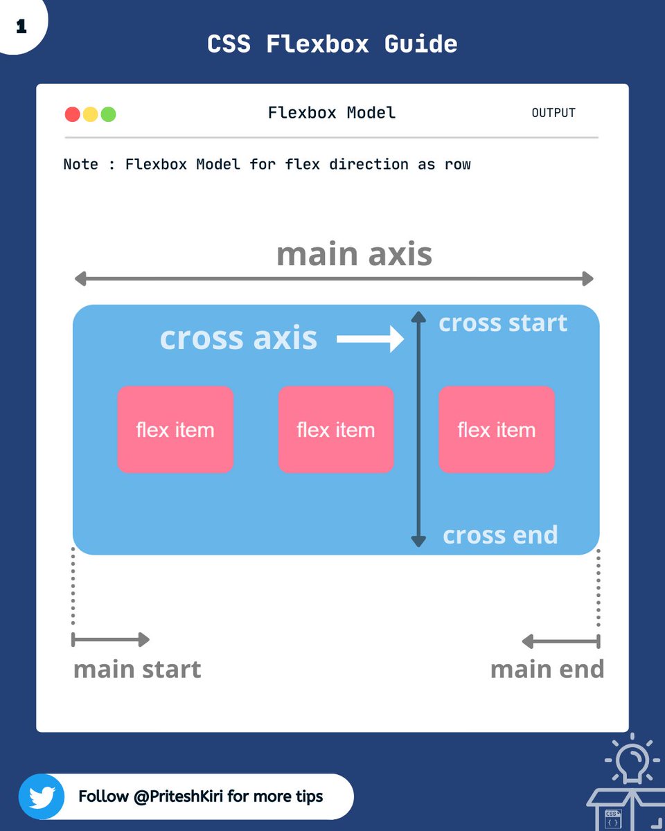
Let me show you the flexbox model, which will help you to understand this better.
- main-axis: This is the axis along the flex-items. It changes with
direction ( row/column).
- cross-axis: This is the axis perpendicular to the flex-item direction.
- main-axis: This is the axis along the flex-items. It changes with
direction ( row/column).
- cross-axis: This is the axis perpendicular to the flex-item direction.
1. flex-direction :
This property helps you decide the direction in which you want to align your flex items.
🡆 flex-direction: row | row-reverse | column | column-reverse;
This property helps you decide the direction in which you want to align your flex items.
🡆 flex-direction: row | row-reverse | column | column-reverse;

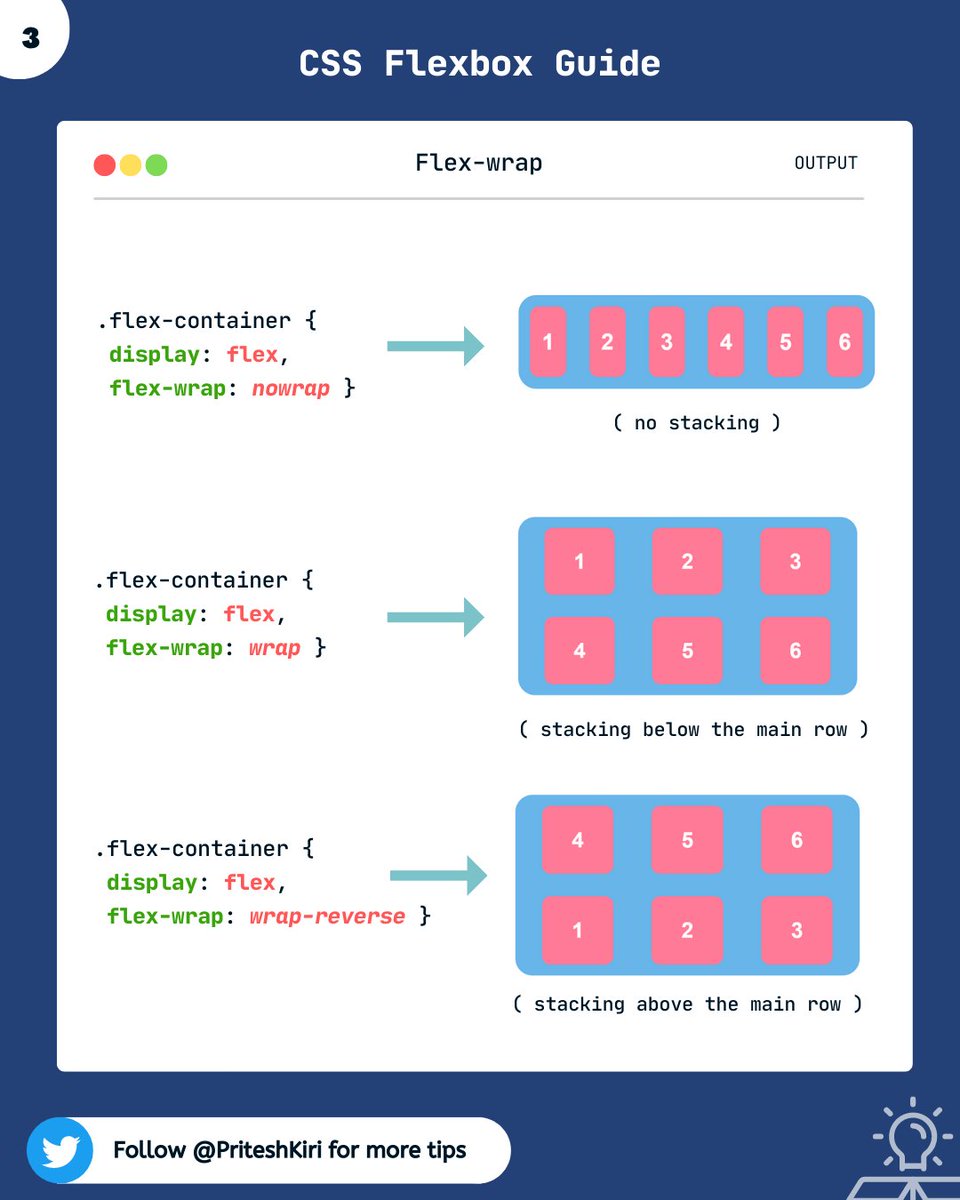
2. flex-wrap :
This property improves the responsiveness of the layout. i.e. flex items will all try to fit onto one line by default. You can change that and allow the items to wrap as needed.
🡆flex-wrap: nowrap | wrap | wrap-reverse;
This property improves the responsiveness of the layout. i.e. flex items will all try to fit onto one line by default. You can change that and allow the items to wrap as needed.
🡆flex-wrap: nowrap | wrap | wrap-reverse;
3. flex-flow :
This is a shorthand for the flex-direction and flex-wrap properties.
🡆 flex-flow: row nowrap;
This is a shorthand for the flex-direction and flex-wrap properties.
🡆 flex-flow: row nowrap;
4. justify-content:
This property helps you arrange the flex items along the main- axis.
🡆 justify-content: flex-start | flex-end | center | space-between | space-around | space-evenly
This property helps you arrange the flex items along the main- axis.
🡆 justify-content: flex-start | flex-end | center | space-between | space-around | space-evenly

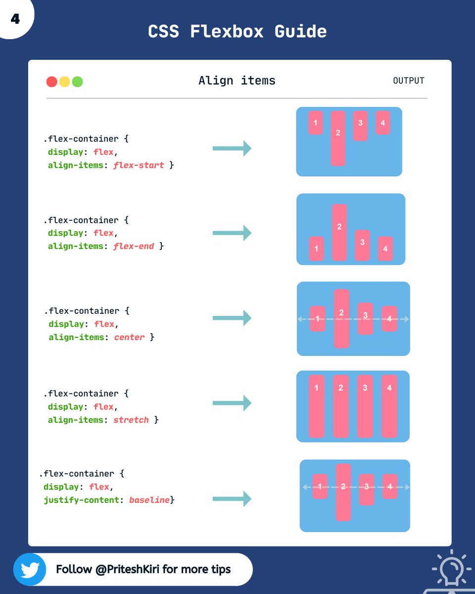
5. align-items:
This property helps you arrange the flex items along the cross-axis.
🡆 align-items: stretch | flex-start | flex-end | center | baseline | first baseline | last baseline
Note: stretch is in respect to min-width/max-width
This property helps you arrange the flex items along the cross-axis.
🡆 align-items: stretch | flex-start | flex-end | center | baseline | first baseline | last baseline
Note: stretch is in respect to min-width/max-width
NOTE: Don't get confused, the main axis is the direction along which the flex items are arranged and the cross axis is perpendicular to it. It will be horizontal if row and verticle if column.
Initially, you will struggle a little but with practice, you'll understand it better.
Initially, you will struggle a little but with practice, you'll understand it better.
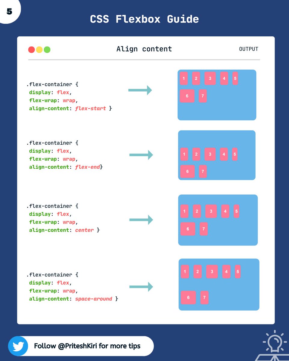
6. align-content:
This property helps you align a flex container’s lines when there is extra space in the cross-axis, similar to how justify-content aligns individual items within the main axis.
Cont.....
This property helps you align a flex container’s lines when there is extra space in the cross-axis, similar to how justify-content aligns individual items within the main axis.
Cont.....
syntax:
🡆 align-content: flex-start | flex-end | center | space-between | space-around | space-evenly | stretch
NOTE : This property only takes effect on multi-line flexible containers, where flex-wrap is set to either wrap or wrap-reverse. Not for single-line flex containers.
🡆 align-content: flex-start | flex-end | center | space-between | space-around | space-evenly | stretch
NOTE : This property only takes effect on multi-line flexible containers, where flex-wrap is set to either wrap or wrap-reverse. Not for single-line flex containers.
Cont ....

This property controls the space between flex items. It applies that spacing only between items not on the outer edges.
🡆 gap: row-gap column-gap
🡆 gap: row-gap column-gap

This was all about the flex container properties. In the next thread, we will discuss flex items properties.
So stay tuned for the next thread at the same time 🙌.
So stay tuned for the next thread at the same time 🙌.
Thanks for reading this thread till the end 😃
🔖 Bookmark this thread for the future
🔃 Retweet the first tweet
🚀 Follow @PriteshKiri for more daily web development tips and tricks
#codewithcoffee #codewithcoffeeindia
🔖 Bookmark this thread for the future
🔃 Retweet the first tweet
🚀 Follow @PriteshKiri for more daily web development tips and tricks
#codewithcoffee #codewithcoffeeindia
Here is PART - 2 of flexbox series.
Do check it out. Here I've explained about flex items properties in detail.
Do check it out. Here I've explained about flex items properties in detail.
Loading suggestions...