

🔷 About HTML Responsive Web Design
A Thread🧵 👇
A Thread🧵 👇
📌 HTML Responsive Web Design
• Responsive web design is about creating web pages that look good on all devices.
• A responsive web design will automatically adjust for different screen sizes and viewports.
• Responsive web design is about creating web pages that look good on all devices.
• A responsive web design will automatically adjust for different screen sizes and viewports.
→ What is responsive web design?
• Responsive Web Design is about using HTML and CSS to automatically resize, hide, shrink, or enlarge, a website, to make it look good on all devices (desktops, tablets, and phones).
• Responsive Web Design is about using HTML and CSS to automatically resize, hide, shrink, or enlarge, a website, to make it look good on all devices (desktops, tablets, and phones).
📌 Steps For Responsive Web Design
→ There are many measures taken for making Web page responsive, which are as follows:
1️⃣ Setting the viewport
2️⃣ Responsive Image
3️⃣ Responsive Text Size
4️⃣ Media Queries
→ There are many measures taken for making Web page responsive, which are as follows:
1️⃣ Setting the viewport
2️⃣ Responsive Image
3️⃣ Responsive Text Size
4️⃣ Media Queries
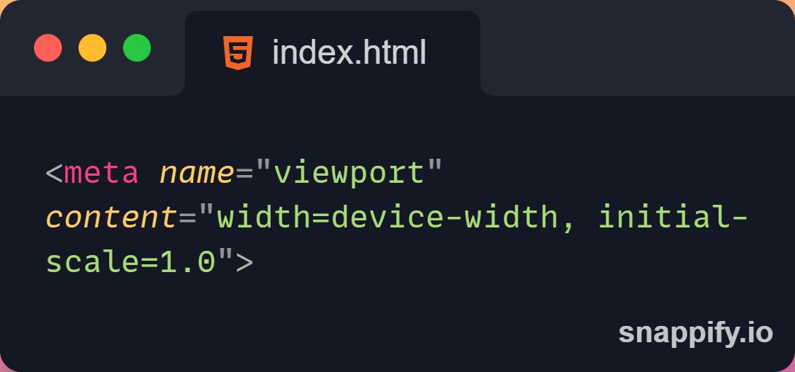
📌 Setting The Viewport
→ To create a responsive website, add the following <meta> tag to all your web pages.
→ This will set the viewport of your page, which will give the browser instructions on how to control the page's dimensions and scaling.
→ To create a responsive website, add the following <meta> tag to all your web pages.
→ This will set the viewport of your page, which will give the browser instructions on how to control the page's dimensions and scaling.
📌 Responsive Images
• Responsive images are images that scale nicely to fit any browser size.
→ Using the width property
• If the CSS width property is set to 100%, the image will be responsive and scale up and down.
• Responsive images are images that scale nicely to fit any browser size.
→ Using the width property
• If the CSS width property is set to 100%, the image will be responsive and scale up and down.

→ Using the max-width property
• If the max-width property is set to 100%, the image will scale down if it has to, but never scale up to be larger than its original size.
• If the max-width property is set to 100%, the image will scale down if it has to, but never scale up to be larger than its original size.

→ Show Different Images Depending on Browser Width
• The HTML <picture> element allows you to define different images for different browser window sizes.
• The HTML <picture> element allows you to define different images for different browser window sizes.

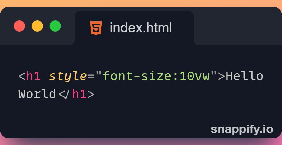
📌 Responsive Text Size
→ The text size can be set with a "vw" unit, which means the "viewport width".
→ That way the text size will follow the size of the browser window.
→ Viewport is the browser window size. 1vw = 1% of viewport width.
→ The text size can be set with a "vw" unit, which means the "viewport width".
→ That way the text size will follow the size of the browser window.
→ Viewport is the browser window size. 1vw = 1% of viewport width.
→ If the viewport is 50cm wide, 1vw is 0.5cm.
📌 Media Queries
→ In addition to resize text and images, it is also common to use media queries in responsive web pages.
→ With media queries you can define completely different styles for different browser sizes.
→ In addition to resize text and images, it is also common to use media queries in responsive web pages.
→ With media queries you can define completely different styles for different browser sizes.

Thanks for reading this thread ❤️
If you like it , make sure you:
🔷 Like the tweet
🔷 Retweet the first tweet ⚡
For more content , follow:
@MrunayU
If you like it , make sure you:
🔷 Like the tweet
🔷 Retweet the first tweet ⚡
For more content , follow:
@MrunayU
You can read the unrolled version of this thread here: typefully.com
جاري تحميل الاقتراحات...