

What is #dataviz animation good for? A thread with examples.
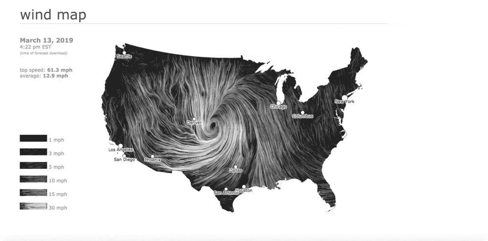
By far the most common and intuitive use is to show time


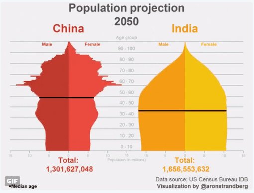
Population over time
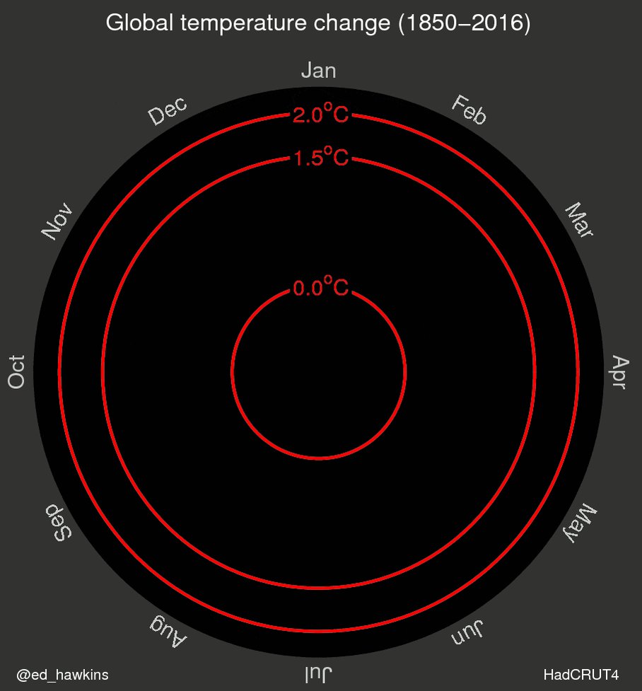
Global temperature change over time
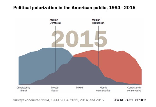
Political polarization over time
#interactive" target="_blank" rel="noopener" onclick="event.stopPropagation()">people-press.org
#interactive" target="_blank" rel="noopener" onclick="event.stopPropagation()">people-press.org

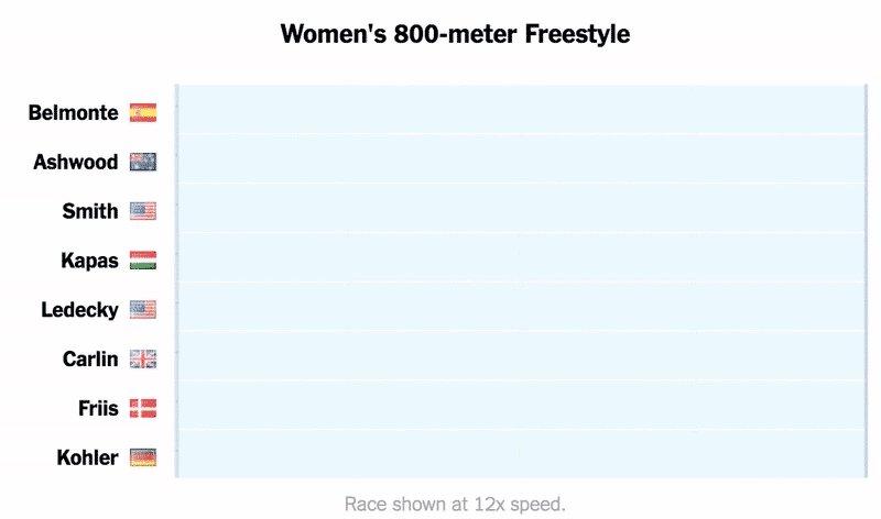
Position in the pool over time
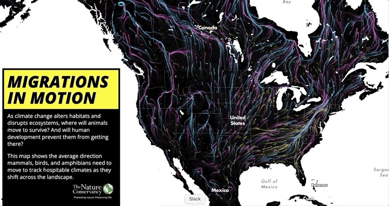
The NYT example also shows movement in space. Another more intuitive use for animation.


Movement of balls
@karimdouieb/all-the-passes" target="_blank" rel="noopener" onclick="event.stopPropagation()">observablehq.com
@karimdouieb/all-the-passes" target="_blank" rel="noopener" onclick="event.stopPropagation()">observablehq.com

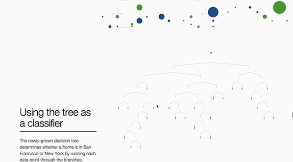
Perhaps less intuitive for a creator, but powerful for the viewer is to Show Process


Or the simplified process of going from high school player to NBA superstar (or not)
pudding.cool
pudding.cool

Or dropping from a high income household to a lower income household
nytimes.com
nytimes.com


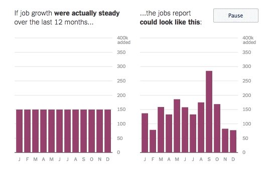
Far less common is using animation to show variability.

Folks at the University of Washington did some of the original research with Hypothetical Outcome Plots
medium.com
medium.com
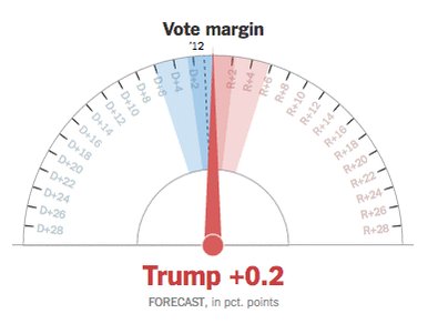
And election predictions with the dreaded needle
Panning and zooming can be effective to emphasize or deemphasize data points

Emphasizing just how much Flint's water is beyond the standard

Emphasizing the immensity of the new interest in Prince after his death
pudding.cool
pudding.cool


Loading suggestions...