

After a long time! Continuing the series again....🚀
⚡ 2D & 3D Transforms in CSS ⚡
⚡ 2D & 3D Transforms in CSS ⚡

Inside the thread 🧵⇣⇣⇣
⇨ This thread is just going to be an overview of CSS 2d & 3d transform properties!
⇨ Why? I want you to explore it yourself, try to code & understand it fully.
⇨ Though I have explained almost every property here + cheatsheet!
Let's go! 🚀
⇨ This thread is just going to be an overview of CSS 2d & 3d transform properties!
⇨ Why? I want you to explore it yourself, try to code & understand it fully.
⇨ Though I have explained almost every property here + cheatsheet!
Let's go! 🚀
📌Before starting the thread, I would like to introduce you to @DevBytesApp
✧ It helps you learn about languages such as Python, JavaScript, SQL and many tech stacks like Web, Android, etc.
✧ It summarizes all the information in just 64 words.
🔗
play.google.com
✧ It helps you learn about languages such as Python, JavaScript, SQL and many tech stacks like Web, Android, etc.
✧ It summarizes all the information in just 64 words.
🔗
play.google.com
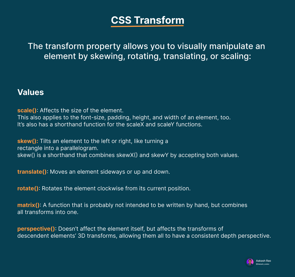
The transform property allows us to visually manipulate an element by skewing, rotating, translating, or scaling.
It has [6] values: out of which [4] are mainly used!
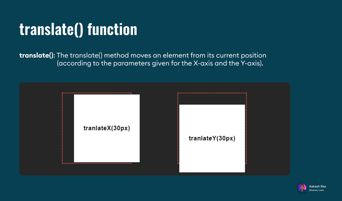
① translate()
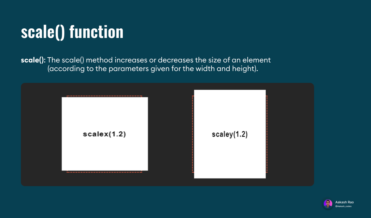
② scale()
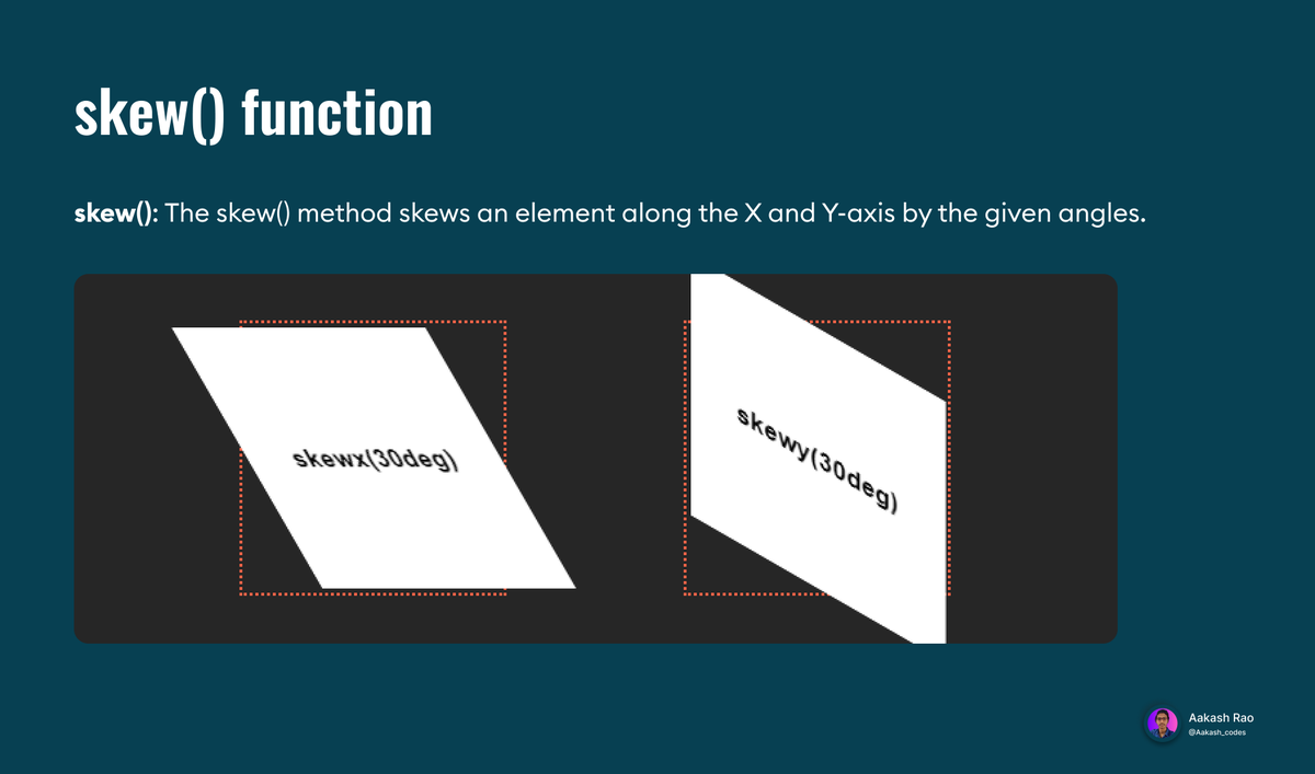
③ skew()
④ rotate()
⑤ matrix()
⑥ perspective()
It has [6] values: out of which [4] are mainly used!
① translate()
② scale()
③ skew()
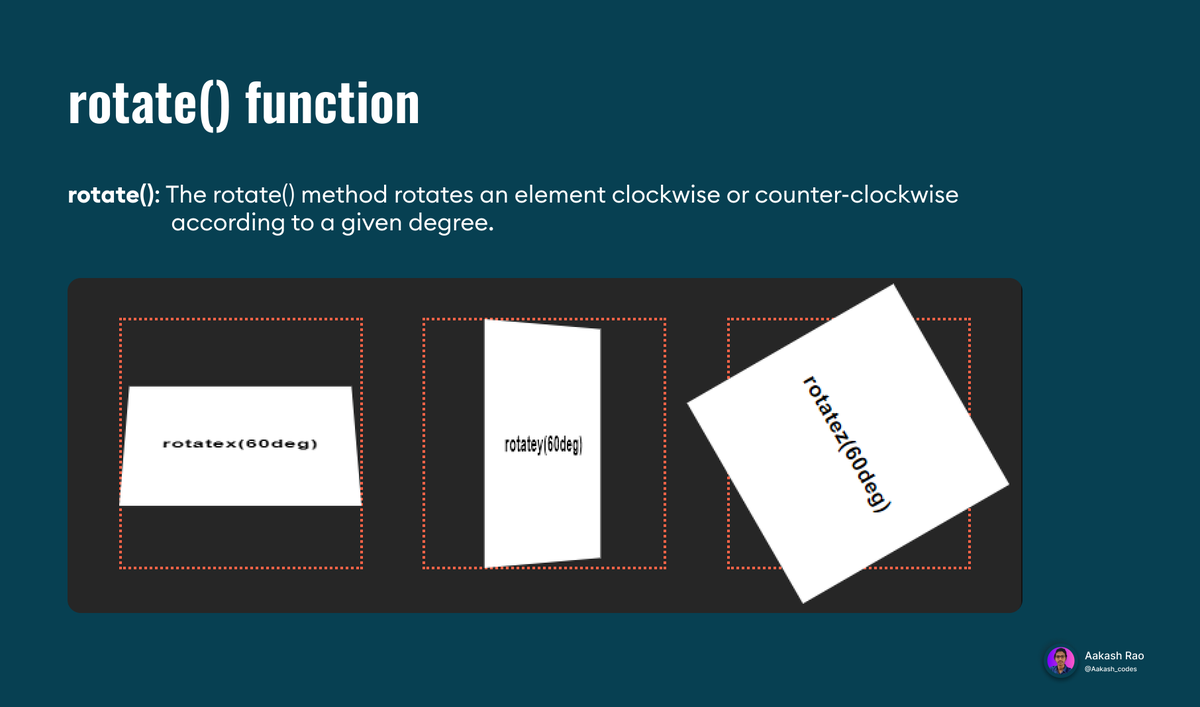
④ rotate()
⑤ matrix()
⑥ perspective()
① translate()
② scale()
③ skew()
④ rotate()
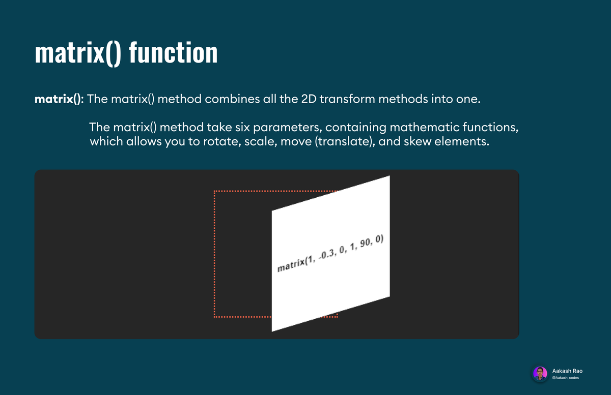
⑤ matrix()
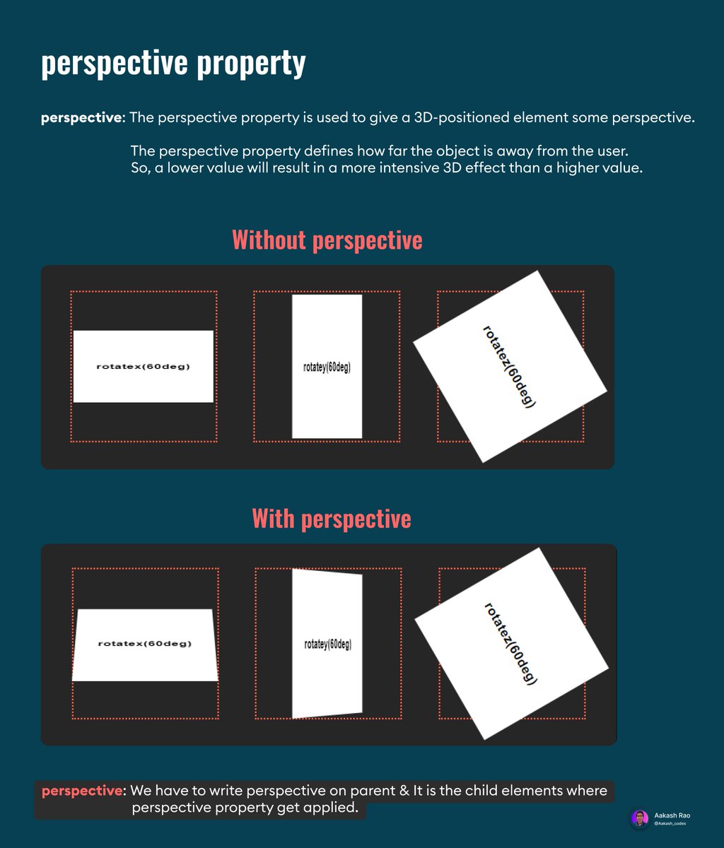
The Perspective property
The transform-origin property

Codepen link for a better understanding! ✨
codepen.io
codepen.io
🏁 Final Words
✧ I hope you get a good understanding of transforms in CSS!
✧ What's next? You can try & play with CSS transforms they are really cool. 🙌
✧ I hope you get a good understanding of transforms in CSS!
✧ What's next? You can try & play with CSS transforms they are really cool. 🙌
💭 Feedbacks
✧ After reading through the entire thread, have you learned something worth it?
✧ What improvements will you suggest?
I will be happy to hear from you. Feedback from you would help me share better content in the future.
✧ After reading through the entire thread, have you learned something worth it?
✧ What improvements will you suggest?
I will be happy to hear from you. Feedback from you would help me share better content in the future.
Previous threads!
[Day-1]
[Day-1]
[Day-2]
[Day-3]
[Day-4]
📌 If you are interested in following this series ⇩
⇝ Follow @Aakash_codes ✓
⇝ To never miss anything, keep your 🔔 ON.
⇝ Share it with your friends if they are interested!
Thanks for the support 💜
Here is the complete infographic for series ⇩
⇝ Follow @Aakash_codes ✓
⇝ To never miss anything, keep your 🔔 ON.
⇝ Share it with your friends if they are interested!
Thanks for the support 💜
Here is the complete infographic for series ⇩
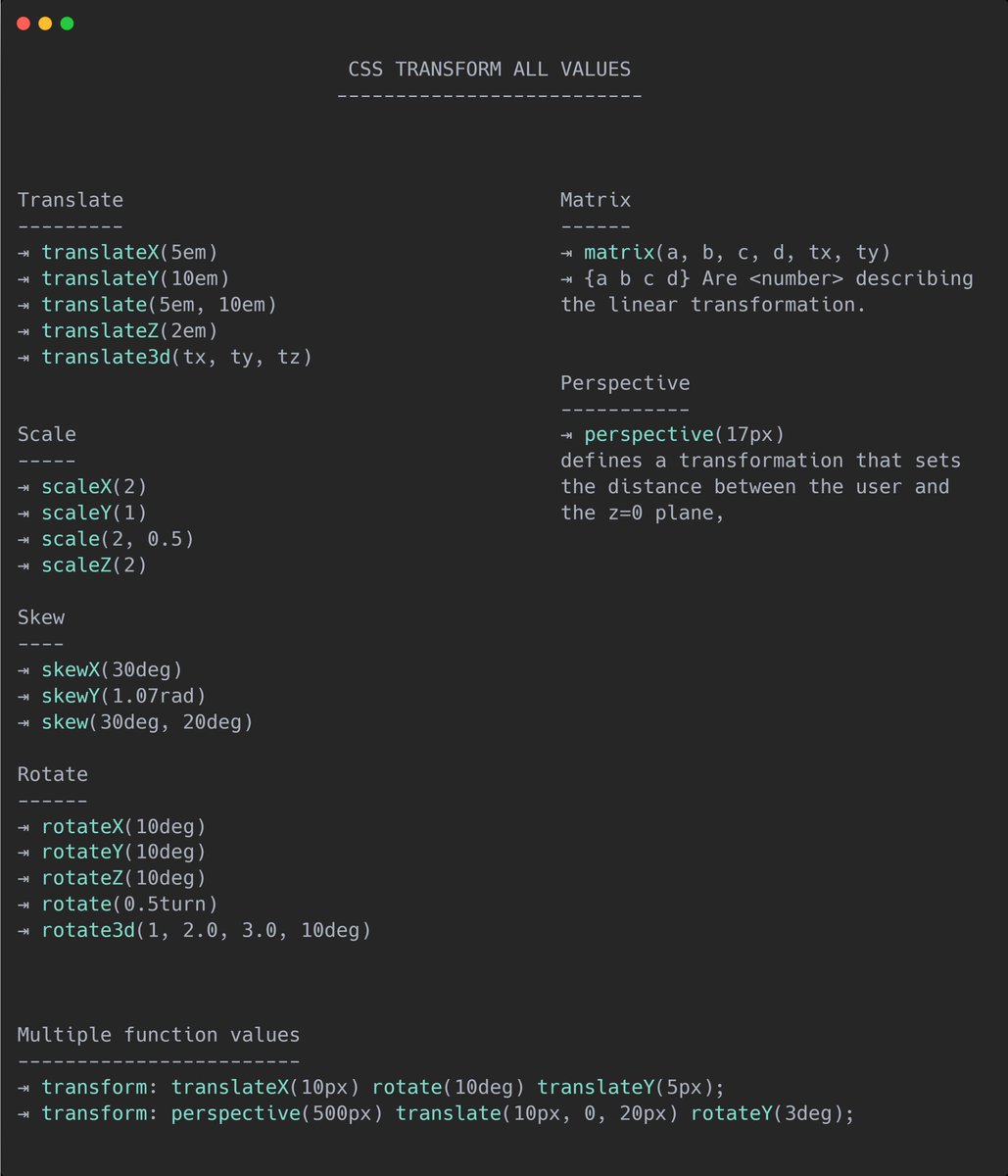
All Transform values Cheatsheet!
Loading suggestions...