

💚 Day 9️⃣2️⃣ / 1️⃣0️⃣0️⃣ Master in CSS Design series!
🤔 Do you know?
→ What are rem and em units?
→ What are the differences b/w the rem and em units?
→ What's wrong with em unit?
→ Why did I love to use rem units?
⛔ So, This🧵 is for you!
#webdev
Let me explain!🧵👇
🤔 Do you know?
→ What are rem and em units?
→ What are the differences b/w the rem and em units?
→ What's wrong with em unit?
→ Why did I love to use rem units?
⛔ So, This🧵 is for you!
#webdev
Let me explain!🧵👇

⛔ First of all, we have to know, that only 2 choices we have for using units with CSS properties.
1️⃣ Absolute units (px, cm, mm, etc)
2️⃣ Relative units (rem, em, %, etc)
1️⃣ Absolute units (px, cm, mm, etc)
2️⃣ Relative units (rem, em, %, etc)
1️⃣ Absolute units
→ Absolute units are fixed units.
→ It is not used for responsive design.
→ At the end, all relative units are converted into PX units(Absolute units).
→ Absolute units are fixed units.
→ It is not used for responsive design.
→ At the end, all relative units are converted into PX units(Absolute units).
2️⃣ Relative units
→ But, if we think about responsiveness then we have to use relative units like rem, em, %, etc.
→ It helps in responsive design because its dynamic not fixed like pixels values.
→ That's why many developers love to use relative units.
→ But, if we think about responsiveness then we have to use relative units like rem, em, %, etc.
→ It helps in responsive design because its dynamic not fixed like pixels values.
→ That's why many developers love to use relative units.
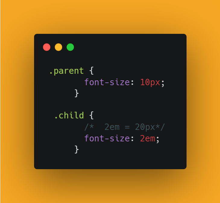
📌 EM units
→ The EM units allow us to set the font size of an element relative to the font size of its parent element.
→ Or, it changed the size of the child element relative to its parent element.
→ The EM units allow us to set the font size of an element relative to the font size of its parent element.
→ Or, it changed the size of the child element relative to its parent element.
⛔ Codepen link on EM unit:
codepen.io
codepen.io
→ But, when we used the EM unit with other properties within the child element,
then it's changed relative to the font size of the child element itself.
then it's changed relative to the font size of the child element itself.

⛔ Codepen link:
codepen.io
codepen.io
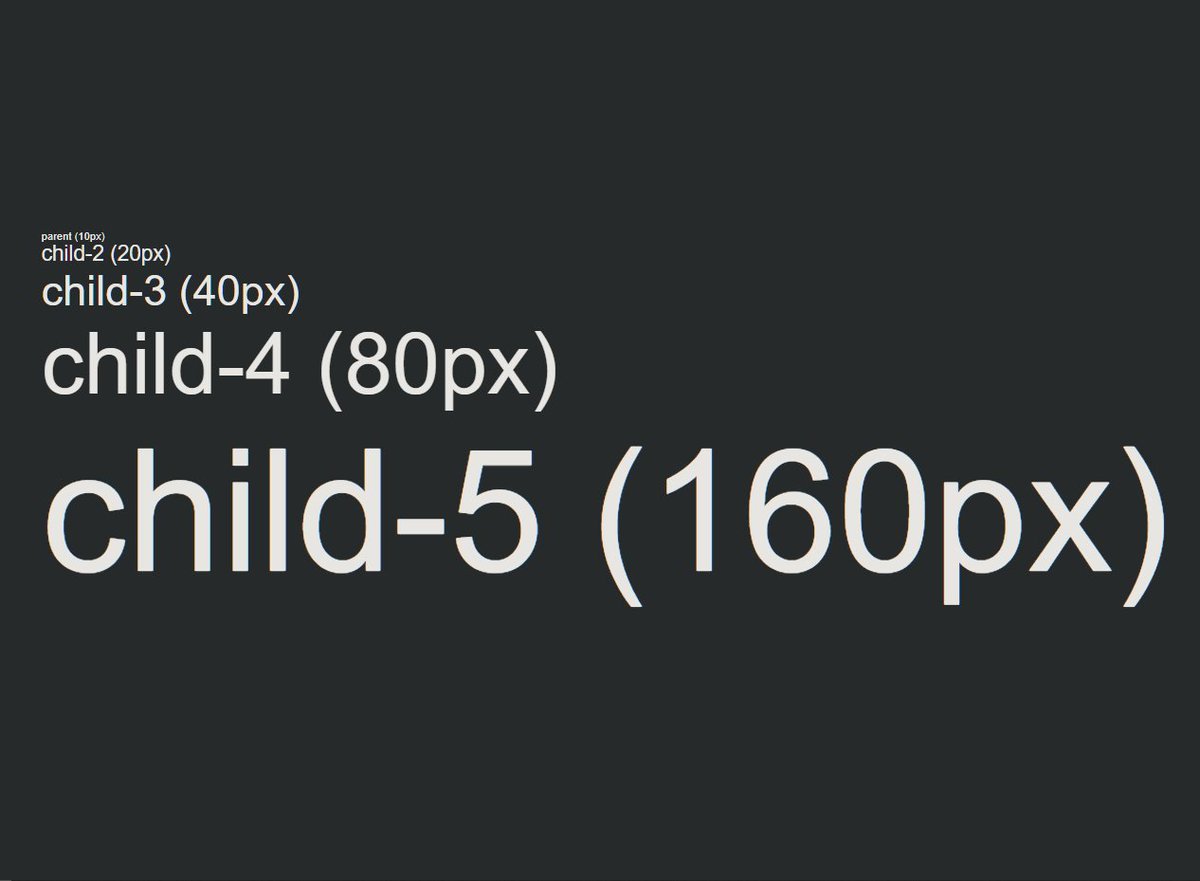
📌 Disadvantage of EM unit
→ This is the problem with EM units!
→ It's compounded with the previous values!
10px
20px
40px
80px
160px
→ This is the problem with EM units!
→ It's compounded with the previous values!
10px
20px
40px
80px
160px
⛔ Codepne link:
codepen.io
codepen.io
📌 REM unit
→ REM unit means ROOT EM.
→ That means it changed the size relative to the root element.
→ <HTML> is the root element of the web page.
→ We have to define the font size in the root element.
→ REM unit means ROOT EM.
→ That means it changed the size relative to the root element.
→ <HTML> is the root element of the web page.
→ We have to define the font size in the root element.
→ If we do not define the font size in the root element, then the default font size is 16px.
📌 Extra:
📌 Extra:
→ In other words, only the font size of the root element will be considered, without related to the parent elements like the EM unit.
⛔ Codepen link:
codepen.io
⛔ Codepen link:
codepen.io
💚 In short:
→ EM unit is relative to its parent element!
→ REM unit is relative to the ROOT element that is <HTML>!
→ EM unit is relative to its parent element!
→ REM unit is relative to the ROOT element that is <HTML>!
If you like this make sure to:
1. Follow me @ATechAjay
2. Retweet the first tweet.
3. Turn on the notification to never miss these amazing tweets.
Thank you so much for staying to the end of this thread.
1. Follow me @ATechAjay
2. Retweet the first tweet.
3. Turn on the notification to never miss these amazing tweets.
Thank you so much for staying to the end of this thread.
Loading suggestions...