

Instead of the FUD let’s have another look at FOMO
(including price predictions* 👀).
The chart below is not as intuitive, therefore this time a more detailed explanation as there are some very interesting insights: 🧵👇
#Bitcoin
(including price predictions* 👀).
The chart below is not as intuitive, therefore this time a more detailed explanation as there are some very interesting insights: 🧵👇
#Bitcoin

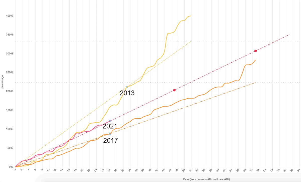
We are comparing each bull market by taking an aggregate of the days that we have been exploring/discovering new ATH’s aka the most bullish days of #bitcoin when FOMO is at peak levels.
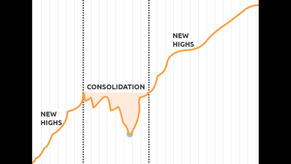
Consolidation is left out since we are interested in measuring each cycle's FOMO strength.
Consolidation is left out since we are interested in measuring each cycle's FOMO strength.
By doing this we find a few very interesting observations:
The strength of each cycle stays remarkably consistent for the entire bull market! It follows a linear path with an uptick at the end.
We had no such uptick yet, a sign that the top is not in? 👀
The strength of each cycle stays remarkably consistent for the entire bull market! It follows a linear path with an uptick at the end.
We had no such uptick yet, a sign that the top is not in? 👀

It looks like the volatility is being ironed out as well (pointed out by @EvanKyusho). One explanation could be the increase in market participants which causes a more continuous demand.
Stay with me here, we are almost done!

Each historic bull market has seen between 52 and 71 days of exploring new highs. Current cycle we have only seen 28 days! The blue dots on the trendline indicate the mid-cycle consolidation. We had exactly the same amount of days in 2017 before consolidating mid-cycle.

In 2013 we had 19 more days of exploring new highs after the mid-cycle consolidation. In 2017 we had another 43 days.
Since this cycle’s strength is in between and if history rhymes, we have another 19 to 43 days to go (red dots on the 2021 trendline).
Since this cycle’s strength is in between and if history rhymes, we have another 19 to 43 days to go (red dots on the 2021 trendline).
If the demand stays consistent, the linear trendline serves as a price floor for the remaining bull market.
The price floor predictions:
equal nb. days as 2013: $142k
equal nb. days as 2017: $392k
#Bitcoin #LaserRayUntil100K
The price floor predictions:
equal nb. days as 2013: $142k
equal nb. days as 2017: $392k
#Bitcoin #LaserRayUntil100K
Loading suggestions...